Visual Narrative Project - Kolesa
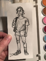
Rough Draft Photos

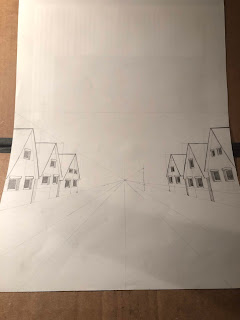
Reference Photos


Final Phase photo

Describe: My piece is just a girl standing at a stop sign with the text "I missed the bus" next to her. The girl is wearing a blue shirt and shorts, with maroon colored sneakers. In front of her and behind her there's grass from another persons lawn and from the little spaces between the sidewalk and the road. I put a road in the center and off to the side, shes standing on a sidewalk. I put some trees in the background of the painting.
Composition arrangement:
I didnt really make the painting the way it looks on purpose, all the pieces just wort of fell into place. I believe that the giant red stop sign is what draws your eye first, but then with the downward direction of the pole and the human figure next to it draws your eye down and over to the girl. Once you look at her, I believe your eye would travel down the text at the bottom right. I also have the road in the background that almost highlights the girls main body because the colors vary greatly from the road. I dont actually feel as though i did any of this on purpose. The only thing I took into consideration was what color her shirt would be so that it would contrast with the stop sign. So with Elements of art i feel like my main one would be color as i have tried to use it wisely and contrast certain elements of the image. For principles of design I would say that my piece has rmphasis on both the giant stop sign and the girl because of the contrasting bright colors that they both contain.
Story:
The story is basically just my story of yesterday. I woke up at 5:00 am like i normally do but i fell back asleep and woke back up only with only 4 minutes to get ready before the bus came and lo and behold i didnt make it. I shoved all my stuff in my backpack as fast as I could and pulled on random clothes and i didnt even put on socks i just pulled my shoes on. I went running out to the bus stop and definitely missed the bus. So Id say that this girls story is pretty much the same. I made her have one shoe untied, and one shoe with a long sock, and I imagine that the untied shoe just has a much shorter sock on. Her t shirt is too big and probably the first thing that she could grab, and i imagine the shorts are the same. I have the same shorts as you can see from my reference photos but i would never actually wear them to school. It would only be if i was running late that I would put those on. I also tried to make the girl at least slightly different from me because I didnt just want it to be a self insert piece. So when i get to her skin tone shell probably have a lot tanner skin than I do, and I also made her hair a lot darker as well as curly. I like the look of the girl even though this piece is definitely not my favorite. The stop sign is also a reference to my own bus stop because its on a corner like this and we have a stop sign right by where I stand in the morning.
Personal Strength and Growths
I definitely learned a lot with this piece and with the previous one that I was going to do. I really thought that I was going to like this project because I actually play dungeons and dragons so i literally have about 15 characters, designs and backstories, at my disposal at any time. Im really upset with myself about how i have been unable to make something work for this project that utilizes one of my original NCPs that literally have their stories already written out for them. I decided to actually try and create creative and interesting new settings, character designs, and situations so that I can become better at things like this. I really have a hard time with the more crative side of art that isnt just copying a human figure down in my sketchbook. Because I think Ive established I can draw people. I can draw people well and make them look good. Its the creative part of outfit design and set design that I really have trouble with. This project however has been really good for developing my skills with watercolor. I have only done a couple of paintings with my watercolors and this and the previous drawing has been good for developing my skills.


Reference Photos


Final Phase photo

Composition arrangement:
I didnt really make the painting the way it looks on purpose, all the pieces just wort of fell into place. I believe that the giant red stop sign is what draws your eye first, but then with the downward direction of the pole and the human figure next to it draws your eye down and over to the girl. Once you look at her, I believe your eye would travel down the text at the bottom right. I also have the road in the background that almost highlights the girls main body because the colors vary greatly from the road. I dont actually feel as though i did any of this on purpose. The only thing I took into consideration was what color her shirt would be so that it would contrast with the stop sign. So with Elements of art i feel like my main one would be color as i have tried to use it wisely and contrast certain elements of the image. For principles of design I would say that my piece has rmphasis on both the giant stop sign and the girl because of the contrasting bright colors that they both contain.
Story:
The story is basically just my story of yesterday. I woke up at 5:00 am like i normally do but i fell back asleep and woke back up only with only 4 minutes to get ready before the bus came and lo and behold i didnt make it. I shoved all my stuff in my backpack as fast as I could and pulled on random clothes and i didnt even put on socks i just pulled my shoes on. I went running out to the bus stop and definitely missed the bus. So Id say that this girls story is pretty much the same. I made her have one shoe untied, and one shoe with a long sock, and I imagine that the untied shoe just has a much shorter sock on. Her t shirt is too big and probably the first thing that she could grab, and i imagine the shorts are the same. I have the same shorts as you can see from my reference photos but i would never actually wear them to school. It would only be if i was running late that I would put those on. I also tried to make the girl at least slightly different from me because I didnt just want it to be a self insert piece. So when i get to her skin tone shell probably have a lot tanner skin than I do, and I also made her hair a lot darker as well as curly. I like the look of the girl even though this piece is definitely not my favorite. The stop sign is also a reference to my own bus stop because its on a corner like this and we have a stop sign right by where I stand in the morning.
Personal Strength and Growths
I definitely learned a lot with this piece and with the previous one that I was going to do. I really thought that I was going to like this project because I actually play dungeons and dragons so i literally have about 15 characters, designs and backstories, at my disposal at any time. Im really upset with myself about how i have been unable to make something work for this project that utilizes one of my original NCPs that literally have their stories already written out for them. I decided to actually try and create creative and interesting new settings, character designs, and situations so that I can become better at things like this. I really have a hard time with the more crative side of art that isnt just copying a human figure down in my sketchbook. Because I think Ive established I can draw people. I can draw people well and make them look good. Its the creative part of outfit design and set design that I really have trouble with. This project however has been really good for developing my skills with watercolor. I have only done a couple of paintings with my watercolors and this and the previous drawing has been good for developing my skills.


Comments
Post a Comment