Posts

Typography Project - Kolesa

Image
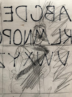
Reference Photos: Progress Picture: Final Project Describe Analyze Interpret Judge Desc: This piece I think actually is one of my biggest successes throughout the entire year in Draw. It was finished on time and I like most everything about it. The mirror is beautiful and very detailed and it was actually a lot of fun to draw. The fonts were fun to play with and I really like all of the fonts I chose. The quote is probably one of my favorites. You suggested to me putting the mirror smudging in the middle and I think that was the finishing touch for this piece. I really like the composition for this and I believe I did a pretty good job this this one. I tried to get fonts that mimicked the fancy imagery and words of the quote. The mirror is very intricate and i feel like the words reflect that. Analyze: I really like this piece and Im pretty proud of it. For elements of art I used texture and line. For Principles of design i used variety and balance.  For t

Open Project - Kolesa

Image
Rough Drafting Reference Picture Artist Inspiration This artist is a contemporary Italian artist named Nicola Samori. His style is really reminiscent of classical renaissance paintings but he destroys parts of his work for more depth and effect. I really like the way that the pieces look like classical paintings but have the modern effect of destroying them. Final Piece  Desc. This was entirely as far as I was able to get with this piece. I started on the face and attempted to actually create a human skin tone but that didnt really pan out. My piece has many contrasting colors to mimic the shadows actually seen on the face from my reference pic. The brush strokes are chunky and visible and the colors are high contrasting. The girl has what is supposed to be a burgundy dress on with a wide neck. The hair is a bit more brown than in the picture but that is actually what I was going for. The composition is in a kind of sideways/diagonal direction. I w

Visual Narrative Project - Kolesa

Image
Rough Draft Photos Reference Photos Final Phase photo Describe: My piece is just a girl standing at a stop sign with the text "I missed the bus" next to her. The girl is wearing a blue shirt and shorts, with maroon colored sneakers. In front of her and behind her there's grass from another persons lawn and from the little spaces between the sidewalk and the road. I put a road in the center and off to the side, shes standing on a sidewalk. I put some trees in the background of the painting. Composition arrangement: I didnt really make the painting the way it looks on purpose, all the pieces just wort of fell into place. I believe that the giant red stop sign is what draws your eye first, but then with the downward direction of the pole and the human figure next to it draws your eye down and over to the girl. Once you look at her, I believe your eye would travel down the text at the bottom right. I also have the road in the background that almost high

Human Figure Project - Kolesa

Image
Rough Draft Photo: This rough draft photo is in my sketchbook from when i was first planning out the structure of the picture Reference Photos: Flowers I used these reference photos for all of the flowers that I put in the background of the drawing. I did a lot of research into different types of flowers and what they mean. Reference Photos: Human Figure This is the original photo that I took and laid a grid over and made black and white to get a better sense of the scale and value of the picture. Final Phase Photo: Describe: This piece is a girl who's smiling and rolling up her pants. Shes sitting down on the ground with trees growing near her. Her shirt is very colorful and matches the background shes sitting against. The background is supposed to be the bank of the creek that shes sitting in front of. Half of the picture is in graphite with lots of tonal values and the other half is in colorful watercolor. The sky is left blank to show a cl
Image
12/9/18 - This second week i also worked on this perspective drawing with the houses. To create this piece i split the page into two sections and i drew a two-point perspective drawing on the bottom half. Once i was done with the houses, in the top section i drew a three-point perspective of a house that looked similar.
Image
11/30/18 - This week i worked on the perspective drawing project. Before break i had figured out how i wanted the lines on the paper to be and where my points of perspective were. I worked on this piece on wednesday because this friday i forgot my project at home and couldnt work during class.

Value Project Write-Up (2/2) - Horse in the Mountains

Image
Describe I made my piece by combining the two images in the other post. My background is of a picture I took in the Rocky Mountains. The horse within my drawing is from a picture off of a free images website. The horse used to have a rider and a saddle on it, but is now just running around on his own. I made my piece only using graphite pencil. I sketched out the whole image roughly, then drew in detail the background, then moved to the foreground and the horse. Analyze The main principles of design that I feel I focused on was texture and value. I tried to create texture in the different faces of the mountains in the background, as well as the clouds above them. I also tried to create texture within the trees in the background, and within the hair in the horse. For value, I really tried to portray the light and how it hit the mountains, and the horse, so that there could be interesting value in the shadows and shapes. I only drew part of the picture that I took because th