Open Project - Kolesa
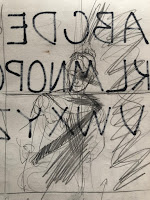
Rough Drafting


Reference Picture

Artist Inspiration


This artist is a contemporary Italian artist named Nicola Samori. His style is really reminiscent of classical renaissance paintings but he destroys parts of his work for more depth and effect. I really like the way that the pieces look like classical paintings but have the modern effect of destroying them.
Final Piece

Desc.
This was entirely as far as I was able to get with this piece. I started on the face and attempted to actually create a human skin tone but that didnt really pan out. My piece has many contrasting colors to mimic the shadows actually seen on the face from my reference pic. The brush strokes are chunky and visible and the colors are high contrasting. The girl has what is supposed to be a burgundy dress on with a wide neck. The hair is a bit more brown than in the picture but that is actually what I was going for. The composition is in a kind of sideways/diagonal direction. I wasnt able to really blend the paint as much as might be possible with a paint like oils that doesnt dry almost immediately. I tried to blend as much as possible but that wasnt actually very possible. The look ended up to be very chunky but I sort of like it. The colors at least are vibrant and contrast well.
Analyze Principles
I think that the elements of art I used well were color and value. Although it literally looks like im color blind because none of the skin looks like actual skin, I did use a lot of color. The light part has lots of attempts at pink and orange and very light off-white variants while the shadow side has lots of blue and purple and some green colors. Though its not really the next Sistine Chapel, I do think that it looks pretty decent and I made it look alright. I think that I also did a good job with value because i did try really hard to make the colors lighter or darker within the picture. i dont think the hair turned out great but it worked on the skin and the dress. For principles of design I think that i did well with contrast and balance. I think that all of the colors contrast very well with each other since they are generally opposite colors used. If i was actually able to get to the background it would contrast well wtih both the cool and warm colors because of the very dark background. I think i did good with balance because the picture is supposed to have this diagonal slant to it and the head and body come from the opposite corner that they face.
Inner Meaning/Symbology
I really didnt make this one with any kind of inner meaning or symbology. I believe Samori uses lots of meaning behind his art in the fact that he uses a lot of religious imagery, while also destroying that imagery. So there is definitely a lot that could be taken away from his pieces but not from mine. I didnt really make this with any biblical message in mind. I dont personally adhere to religion but i dont really have any agenda against it so this piece was made with no sort of religious subtext. I also feel as though an outside viewer could see mine or Samoris pieces as being about the "inner turmoil" of the artist. I feel as though you could see this because of the way the paint covers over parts of the painting and obscures the view of the subject. However, I just made it that way because I think it looked cool.
Judge
I really dislike this piece. This is one of the worst. I really hate that I couldnt actually finish this piece becaue i actually did want to submit it to one of the art competitions but i cant exactly do that now can I. I actually wanted this to look like an actual person and not some weird form that only vaguely resembles a human with the colors. i guess I shouldnt have expected the Ave Maria but I at least it thought it would turn out better. At a certain point I accepted the skin and decided "thats just the way it looks". The face isnt great but i do like the chest. I thought that the dress was very promising as I do think that the neckline and the color look good. However, I did the hair today and I feel like that almost ruined it. I feel like her hair looks really had and basically looks like a bad helmet set on top of her head. I also feel like I did a bad job with the actual shape of the body in the drawing. I thought maybe I was looking at the piece way too long so i was just seeing minute details that were wrong but no its actually wrong. The shoulders and head are way too big to fit on the body i drew and nothing is quite proportional the way that it should be. In the end i guess i did good with some of the contrast in the skin but i didnt even finish the piece and so much about it is just wonky and off and i dont like it. I feel like i need to say sorry to my friend whos picture i used.


Comments
Post a Comment